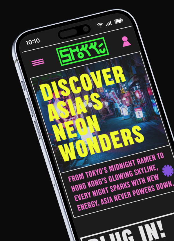
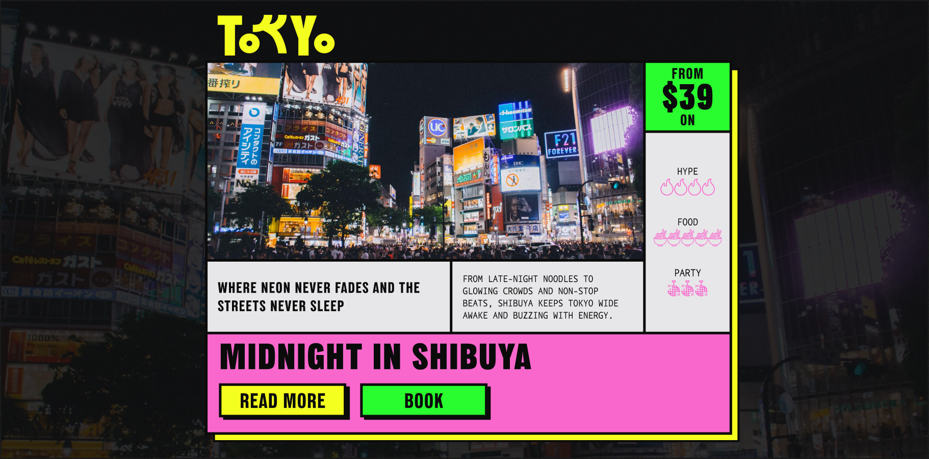
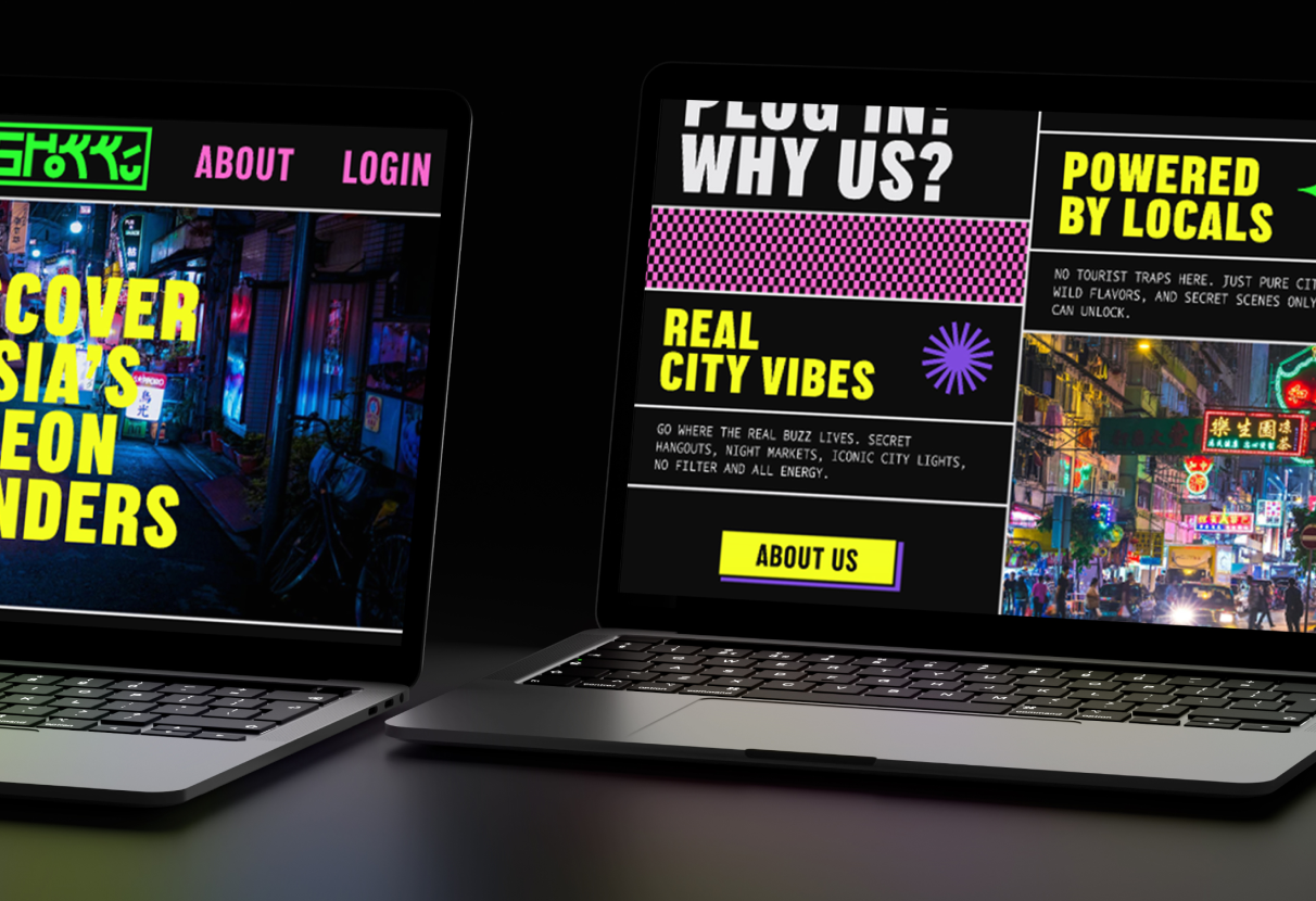
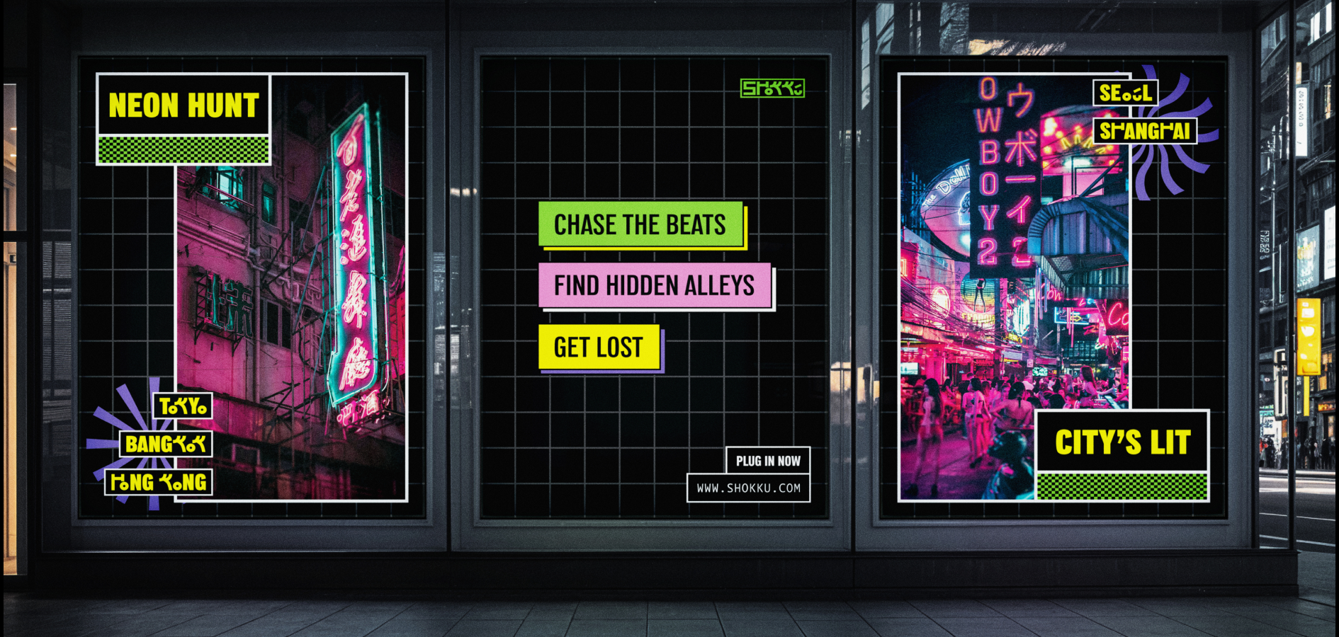
Shokku is a travel brand built around neon city trips across Asia. Designed for nightlife-driven, cinematic travel, the brand captures the energy, culture, and atmosphere of cities like Tokyo, Seoul, Bangkok, Hong Kong, and Shanghai after dark.
Shokku is a travel brand built around neon city trips across Asia. Designed for nightlife-driven, cinematic travel, the brand captures the energy, culture, and atmosphere of cities like Tokyo, Seoul, Bangkok, Hong Kong, and Shanghai after dark.
THE CHALLENGE
Most travel brands focus on landmarks, tradition, and sightseeing. The challenge was to create a brand that celebrates the contemporary side of Asia and captures the excitement of its nightlife, food culture, and urban energy while standing apart from conventional travel platforms.
Most travel brands focus on landmarks, tradition, and sightseeing. The challenge was to create a brand that celebrates the contemporary side of Asia and captures the excitement of its nightlife, food culture, and urban energy while standing apart from conventional travel platforms.
THE SOLUTION
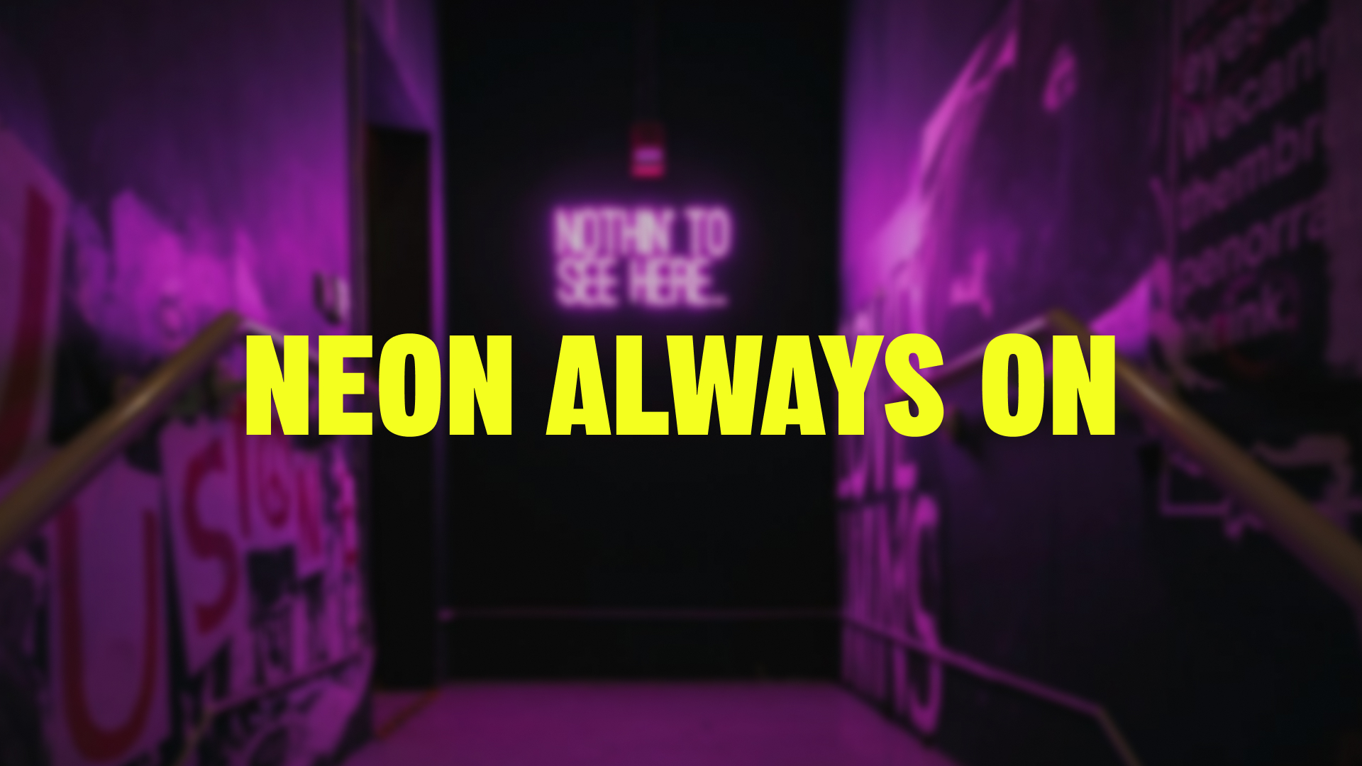
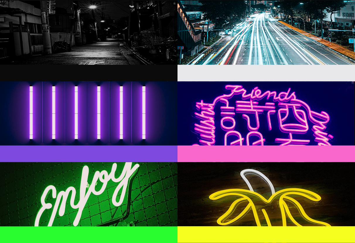
A neo-brutalist identity built around neon colours, expressive typography, and high-contrast layouts. Inspired by the atmosphere of Asia’s nightlife capitals, the brand immerses users in vibrant city experiences through a digital platform that feels as energetic as the destinations themselves.
A neo-brutalist identity built around neon colours, expressive typography, and high-contrast layouts. Inspired by the atmosphere of Asia’s nightlife capitals, the brand immerses users in vibrant city experiences through a digital platform that feels as energetic as the destinations themselves.
THE SOLUTION
DELIVERABLES
Brand Strategy
Brand Identity
Logo Design
Tone of Voice
Website Design
Mobile UI Design
Poster Campaign
Social Media Assets
WHY IT WORKS
Shokku translates the atmosphere of Asia’s neon cities into a cohesive brand experience. The vibrant colour palette, expressive typography, and energetic tone of voice work together to create a distinctive identity that feels as alive as the destinations it promotes.
Shokku translates the atmosphere of Asia’s neon cities into a cohesive brand experience. The vibrant colour palette, expressive typography, and energetic tone of voice work together to create a distinctive identity that feels as alive as the destinations it promotes.
What does your brand feel like?
The best identities aren’t just seen. They’re experienced. Let’s build a brand people want to be part of.