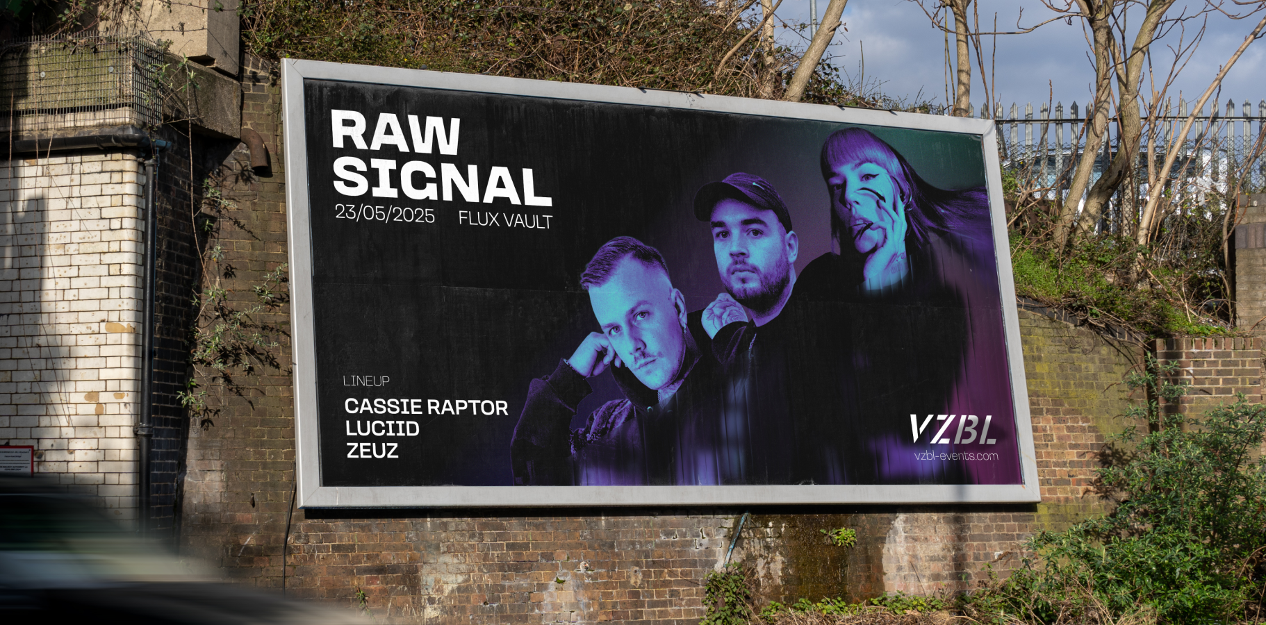
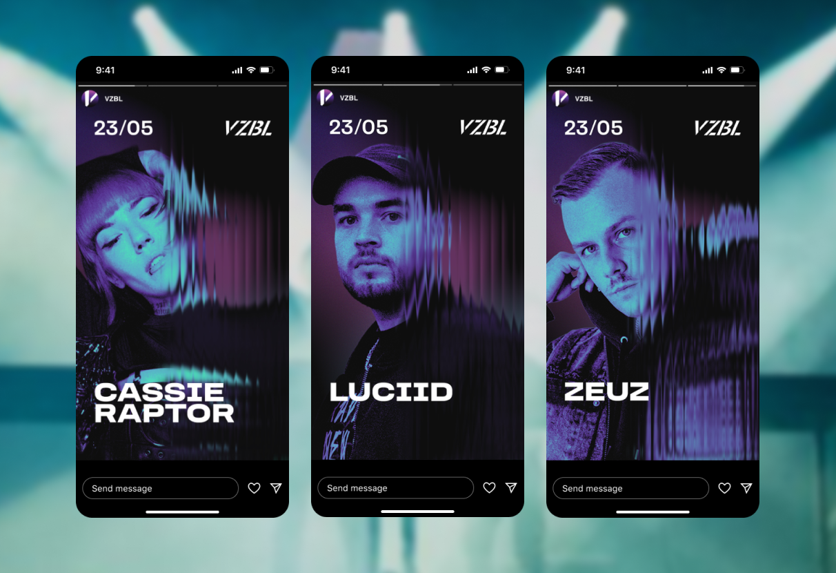
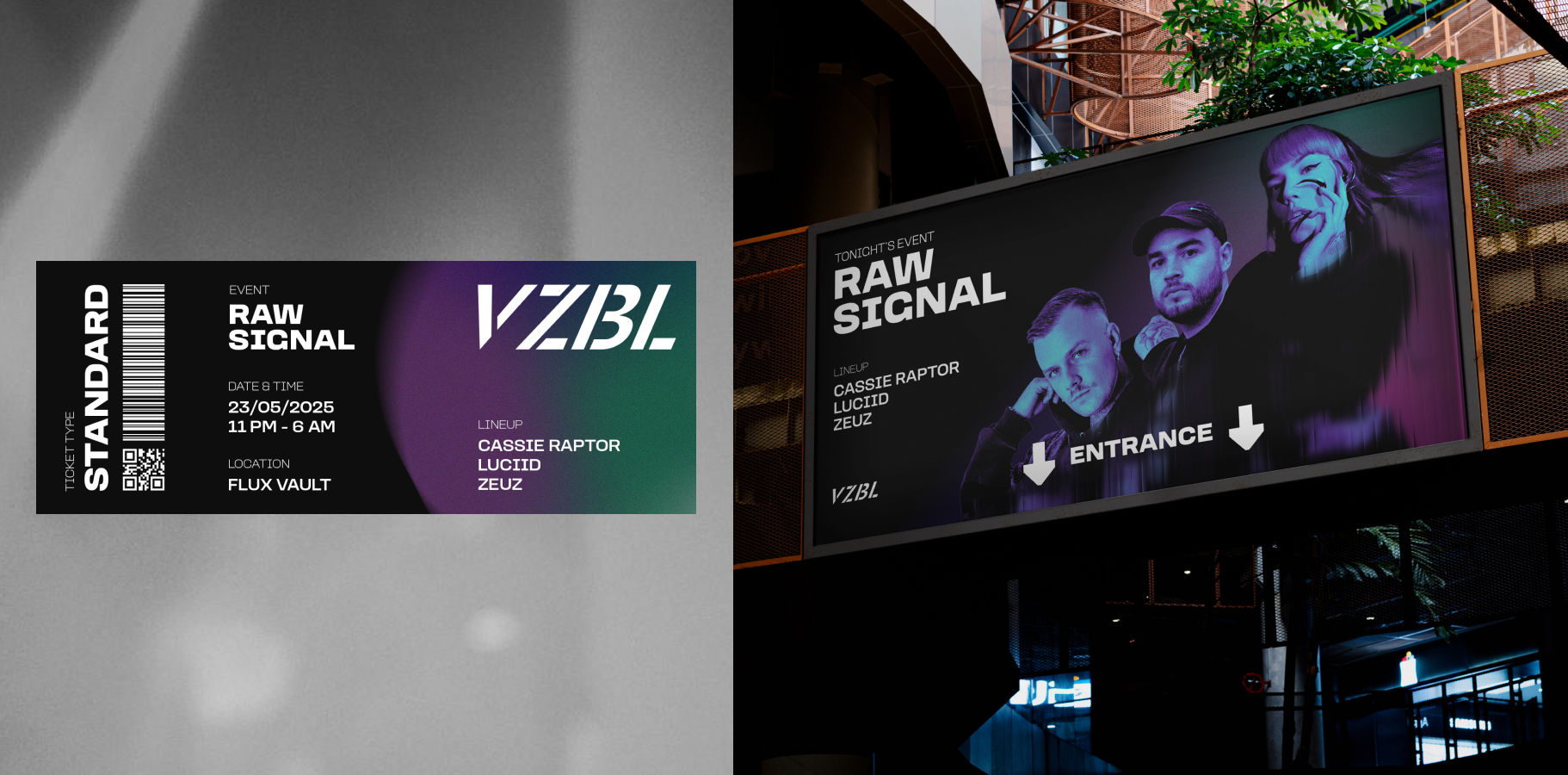
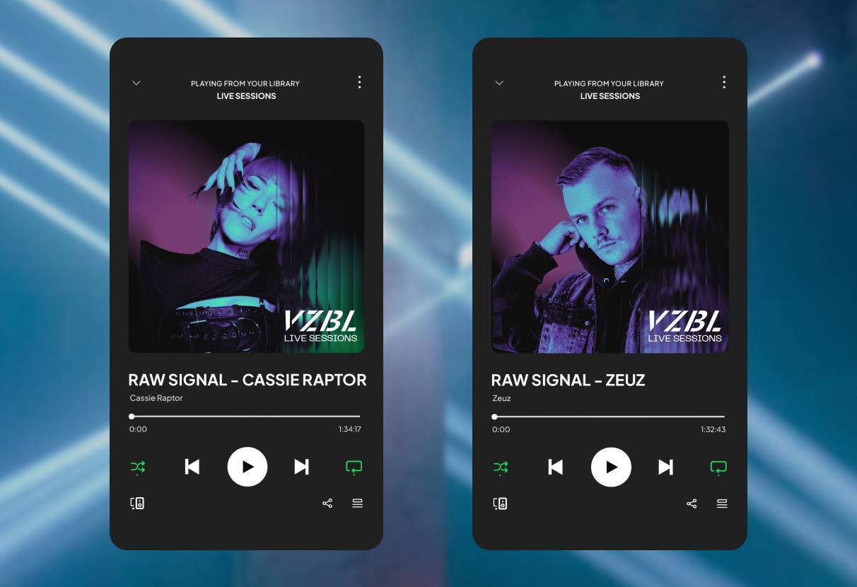
The organisation had lost trust after problematic behaviour at past events was not addressed early or clearly enough. During this time, younger competitors gained momentum and took over parts of the market.
The challenge was to rebuild relevance through a brand that feels safer, more intentional, and ready for a new generation.